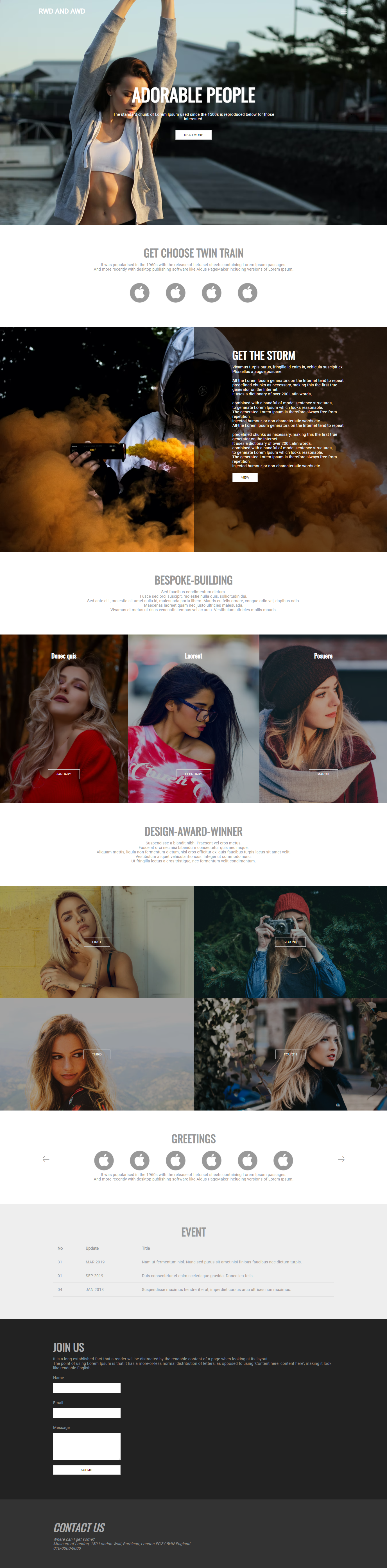
코드 보기
float box 사용 버전
https://codepen.io/lshjju/pen/zYxmQyj
위 코드 동영상 강의 보기
https://www.youtube.com/playlist?list=PLpK-F7ihqVc03CuIb-apIjBwwtQtca6SG
rwd-and-awd-coding
www.youtube.com
코드 보기
이것은 위의 float box 모델을 disply flex 박스모델로 변경한 코드입니다.
박스를 display flex 로 코딩하는 분은 이 코드를 보세요.
https://codepen.io/lshjju/pen/dyZwVpq
AWD
Adaptive Web Design
n개의 디바이스에 적합한 n개의 탬플릿이 요구됩니다.
주소 앞에 m. 따위가 붙기도 합니다.
이런 경우 독립형 디자인SWD이라고 구분해 부르기도 하며, px단위를 사용하고, CSS 코딩 시 어떤 사이즈에 도달하면 디자이너가 준비해둔 레이아웃을 보여주도록 코딩합니다.
AWD CSS 기본코드
@charset "utf-8";
@import url("https://fonts.googleapis.com/css?family=Roboto&display=swap");
@import url("https://fonts.googleapis.com/css?family=Oswald&display=swap");
@import url("https://fonts.googleapis.com/css?family=Playfair+Display&display=swap");

* {
  margin: 0;
  padding: 0;
  list-style: none;
  box-sizing: border-box;
  word-break: keep-all;
  outline: 0px solid silver;
}

img {
  width: 100px;
}

body {
  font-family: "Roboto", sans-serif;
  font-size: 0.9rem;
  line-height: 1rem;
  color: #999;
  letter-spacing: 0.1px;
}

h1,
h2,
h3 {
  font-family: "Oswald", sans-serif;
}

h1 {
  font-size: 4rem;
  line-height: 4rem;
  text-transform: uppercase;
}

h2 {
  font-size: 2.4rem;
  line-height: 2.4rem;
  text-transform: uppercase;
  margin-bottom: 1rem;
  text-align: center;
}

h3 {
  font-size: 1.4rem;
  line-height: 1.4rem;
}

h4,
h5 {
  font-family: "Playfair Display", serif;
}

h4 {
  font-size: 1.1rem;
  line-height: 1.1rem;
}

h5 {
  font-size: 0.7rem;
  line-height: 0.7rem;
}

a:link {
  color: #666;
  text-decoration: none;
}

a:visited {
  color: #666;
}

a:hover {
  color: red;
}

a:active {
  color: red;
}

button {
  font-size: 0.7rem;
  text-transform: uppercase;
  padding: 10px 30px;
  border: 1px solid #ccc;
  background: white;
  cursor: pointer;
  transition: 0.3s;
}

button:hover {
  background: crimson;
  color: white;
}

/* mobile start */

/* laptop start */

@media screen and (min-width: 1366px) {


}

/* end */
요 코드로 css 를 시작하면 AWD를 쉽게 시작할 수 있을것입니다.
end
'UI Design project' 카테고리의 다른 글
| 반응형 웹 사이트 코딩 실무 예제 - RWD (0) | 2025.06.14 |
|---|---|
| 유저의 움직임에 반응하는 웹사이트 실무 코딩 예제 - Active and fixed (1) | 2025.06.14 |
| 브라우저 넓이에 반응하는 웹사이트 실무 코딩 예제 - Flexible and fixed (1) | 2025.06.14 |
| HD 해상도에 최적화 된 웹사이트 코딩 실무 예제 -HD (0) | 2025.06.07 |